|
|
Motivation
I want to familiarize myself with the custom maps download from servers on my local machine, so I moved those files from data/dlcache/ to data/ . Well that makes the maplist very very long, and it's very hard to find a map, unless I know its prefix.
From reading the code, I realized there's a hotkey search. However, that only works for the prefix. Sometimes I can't remember the first word of a map, or even the correct spelling of the first few letters. (English is not my native language.)
Therefore I added the map string filter feature. Users can quickly find a map by its partial name.
What does it do?
When a user chooses a gametype on the left, the maplist on the right is populated on the right. If the user provides extra search word in the Filter box below, the map names containing the search word will remain.
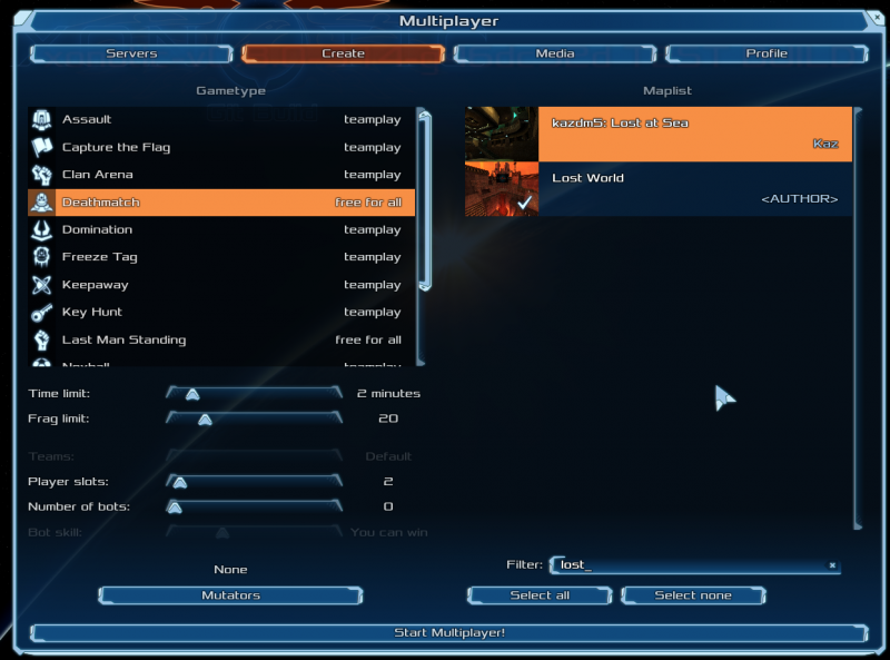
For example, if I type "lost" in the search box, I can see both "Kazdm5: Lost at Sea" and "Lost World".
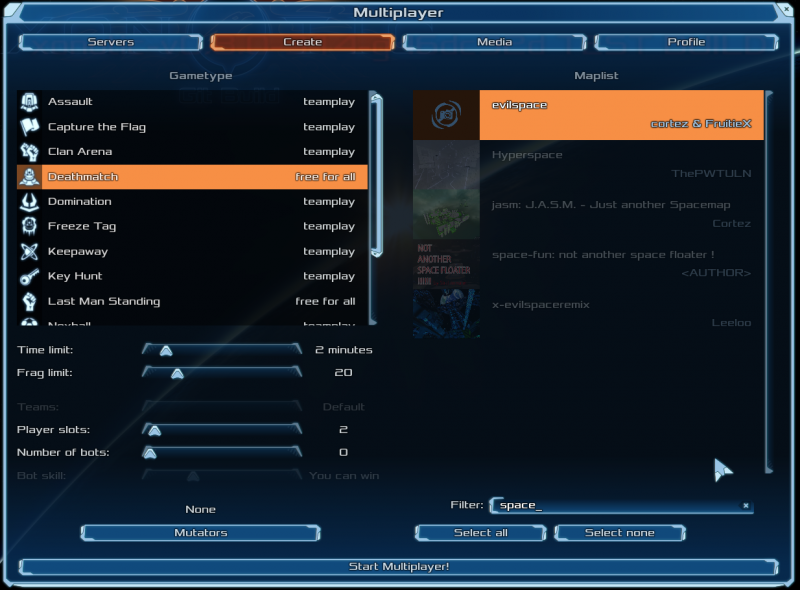
Another example, "space" gives me "evilspace", "Hyperspace", "space-fun", etc.
 My Questions
- Is this a useful feature at all?
- Is there a convention to name a git branch? Say, do we include author name to prevent collision?
- Where do I learn about the workflow of this project, e.g. how does the review process work? Does most coding discussion happen here, in IRC, or in code comments?
|
|
|
04-06-2015, 03:00 AM
(This post was last modified: 04-06-2015, 03:01 AM by Mario.)
Nice one, looks useful!
Most code discussion happens on the IRC channel (irc.freenode.net #xonotic).
Git branches do indeed include author name, e.g. Mario/balance.
A basic guide for setting up repository access is available here: https://gitlab.com/xonotic/xonotic/wikis...ory_Access
We can help with further questions about setting up a development environment on IRC if needed.
|
|
|
Great work BuddyFriendGuy, definitely a useful feature.
|
|
|
Thanks, Mario. I filed the access request. Just to clarify, the slash ('/') in the branch name, say "BuddyFriendGuy/mapStringFilter", is just part of the name, not a delimiter, right?
Thanks, -z-. I'll try to submit it, once I figure out how.
|
|
|
I submitted the completed code for this feature to the branch uddyFriendGuy/mapStringFilter. Right now, it correctly filters the maps in the list by their name (or their BSP filename, if the name is missing from their *.mapinfo files). I also added a hotkey, Ctrl-F, to jump to the filter box.
TODO (probably not by me, at least not now): Currently the Ctrl-F event listener is attached to the entity MapListBox, rather than the whole ServerCreateTab. Ideally, Ctrl-F should work anywhere in this TAB (regardless of the current focus). Also, after Ctrl-F sets the focus to the Filter box, when user hits Enter/Up/Down, the focus should set back to the MapListBox (with Up/Down moving the selection cursor). This involves setting the keyDown listener to the InputBox, and passing other key events back to MapListBox. I'm not familiar with the framework enough to do it correctly.
Thanks, @SilenceKiller and @GoregeousGuy.
|
|
|
As an update, this is completed, including the TODO. Thanks terencehill for spotting bugs (fixed now).
|
|
|
04-16-2015, 07:16 PM
(This post was last modified: 04-16-2015, 07:19 PM by BuddyFriendGuy.)
This is a discussion on the menu layout of this feature. I post the pictures here for discussion before committing the code.
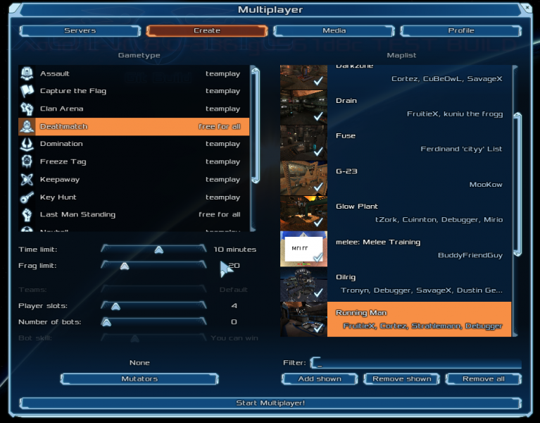
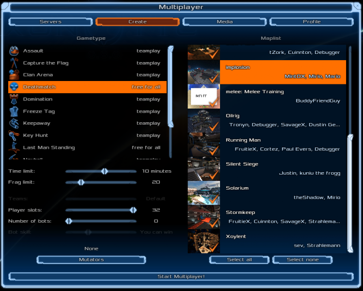
This is the original design:
This is @terencehill suggestion:
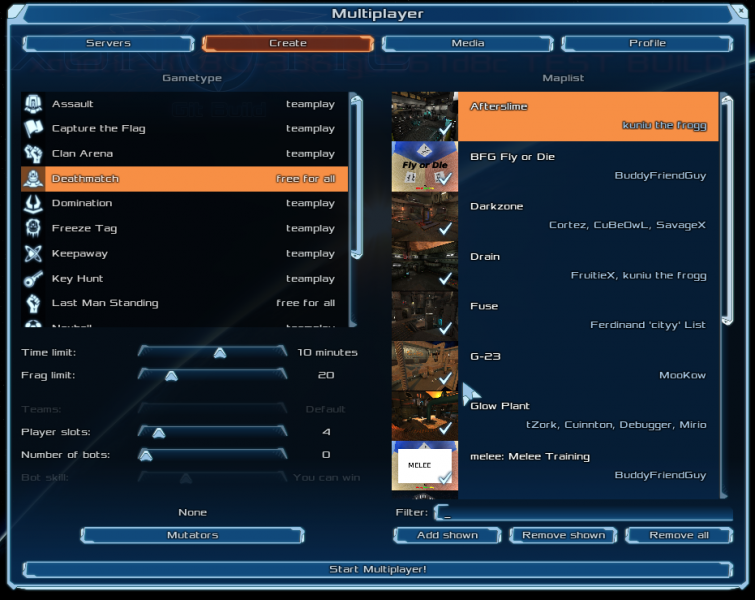
Notice that the maplist box is one row larger, making it closer to the keyword filter box, but with a slightly different height from what's on the left.
|
|
|
I personally find the original cleaner and less crowded.
|
|
|
(04-16-2015, 11:23 PM)-z- Wrote: I personally find the original cleaner and less crowded.
I agree, but maybe the Filter could be moved more towards the maplist (centred)?
|
|
|
04-18-2015, 08:46 AM
(This post was last modified: 04-18-2015, 08:54 AM by terencehill.)
I think that first of all one should design the menu by creating groups of controls when logically connected, then separate different groups, in order tho make the menu less cluttered.
IMO the map list itself + filter + Select buttons have to be considered as one group and put together no matter how they look. Also, as a matter of principle, alignment with the left part of the window shouldn't be taken into account.
(04-17-2015, 07:00 AM)Mirio Wrote: maybe the Filter could be moved more towards the maplist (centred)?
It could be better
|
|
|
(04-18-2015, 08:46 AM)terencehill Wrote: I think that first of all one should design the menu by creating groups of controls when logically connected, then separate different groups, in order tho make the menu less cluttered.
While I agree, I think it makes sense to establish an overarching symmetry, when possible.
In this particular case, take into account that: - other filter inputboxes also have a margin of one row ("Servers" and "Media" dialog)
- the elements on the left side also have gaps in between logical units.
Therefore, I too prefer the original version.
|
|
|
Thanks for all the input.
terencehill has a point from the Xonotic's original design (before I added this feature). Notice how close the maplistBox is to the two buttons below, and notice that the maplistBox is longer than the one on the left. So terencehill is talking about a consistency here.
However, I think the visual problem comes from the big height difference between the label text ("Filter:") and the text box itself.
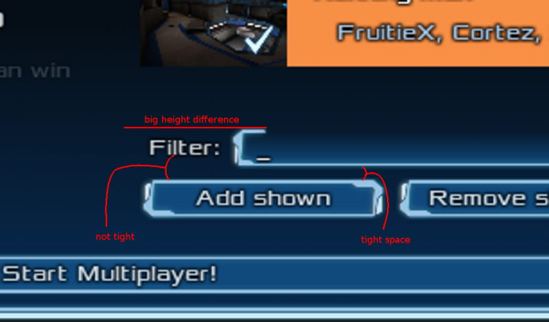
I think here programmatic consistency conflicts with visual comfort because of the design of the components. After all, our cognition is non-linear.
How about this compromise? I move things on both sides farther apart and center them as Mirio suggested, so:
- Space is not too tight
- It matches what's on the left
- The equal distance above and below the Filter box sort of maintains a relationship among maplistBox, FilterBox, and the 3 buttons.
I will also add comments in the code to explain the reasoning, in case somebody in the future wonders why we make this compromise.
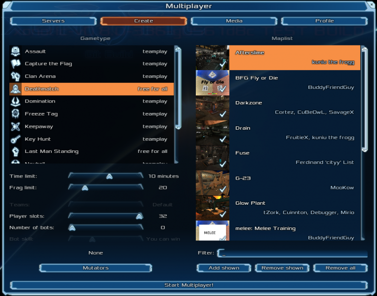
|
|
|
That last screenshot looks good, nice work.
|
|
|
04-18-2015, 06:18 PM
(This post was last modified: 04-18-2015, 06:20 PM by terencehill.)
(04-18-2015, 01:32 PM)BuddyFriendGuy Wrote: However, I think the visual problem comes from the big height difference between the label text ("Filter:") and the text box itself. Again, that should be ignored. IMHO when adding items/controls to a window you shouldn't worry too much about how a single item looks in a specific case, simply make use of it (see it as if menu_showboxes 0.3 were enabled). If anything, that specific item should be redesigned to look more appealing in every situation.
I'm against centering the mutator list preview above the Mutator button for the reason I explained in the previous comment, I consider them as a single item.
|
|
|
My priority here is to have this feature merged as early as possible, rather than coming up with a perfect design that everyone agrees.
Being new here, I have to ask for the wisdom of the senior devs here. What did you do when there were different opinions like this one? Did you vote? Or did you leave the decision to the UI design lead?
|
|
|
I don't think we can reach a 100% consensus here. Both sides have valid points, so it boils down to which design is preferred by more people. After consulting on the dev IRC channel, I started a poll.
Please help move this forward by casting your vote. Thanks!
|
|
|
04-25-2015, 01:22 AM
(This post was last modified: 04-25-2015, 01:24 AM by BuddyFriendGuy.)
Update: The poll closed and 91% of the voters chose this one, and the code for this one was submitted for merging.
![[Image: attachment.php?aid=1399]](http://forums.xonotic.org/attachment.php?aid=1399)
|
|


![[Image: 230.png]](http://stats.xonotic.org/static/badges/230.png)
![[Image: 5801.png]](http://stats.xonotic.org/static/badges/5801.png)
![[Image: 22172.png]](http://stats.xonotic.org/static/badges/archer/22172.png)
![[Image: 6963.png]](http://stats.xonotic.org/static/badges/6963.png)