Create an account


Thread Rating:
  • 0 Vote(s) - 0 Average
  • 1
  • 2
  • 3
  • 4
  • 5
Clockwork

#1
I made a new crazy map: Clockwork [pk3] [sources]

Overview
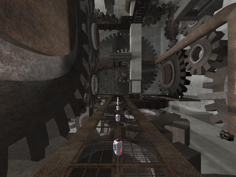
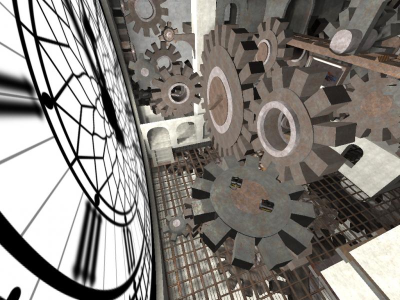
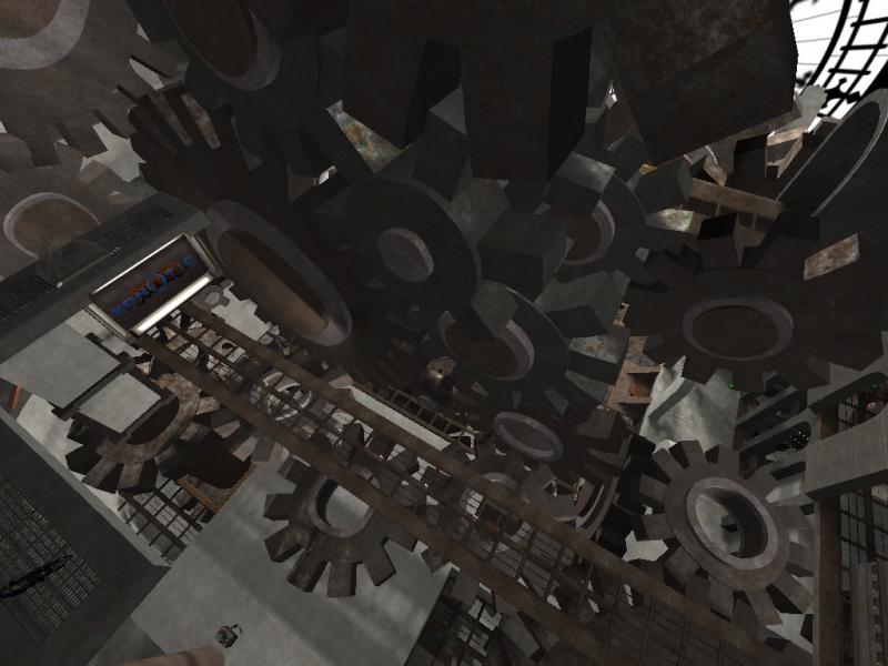
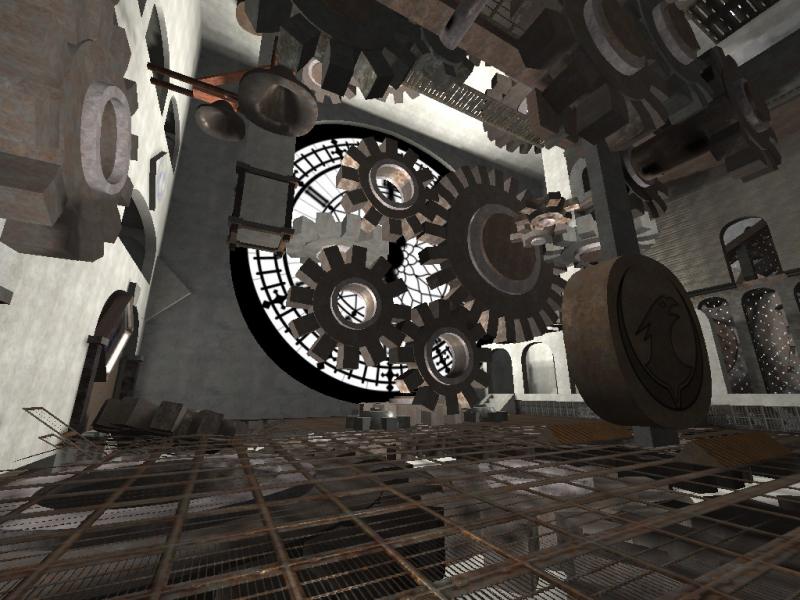
A small, mostly vertical map, with rotating gears all over the place.
The gears act as walls, platforms, obstacle and as a mean to kill your opponents (and yourself if you aren't too careful).

Fun Facts
  • Every 15 minutes it plays a chime
  • The gears aren't really connected to the clock hands Tongue
  • The clock face actually works, shows the time elapsed since the match start
  • After 1 hour a secret door opens for 1 minute, it's up to you to find it and figure whether it's worth the wait Wink
  • I ended up spending more time trying to fix Netradiant than making the map Undecided

Screenshots


Reply

#2
It looks fun, and huge Big Grin

Some gear sounds would have been great, but it might be deafening considering how many gears there are :p
Reply

#3
Impressive! Very good idea but the performance suffers from all the gears movement, which by the way is often simply too fast. It would appear much more consistent if the movement was much slower. The performance could be improved if you used models and It would be awesome if you add gears sound. Try making gears part of a gameplay more, most of them serve just as walls and can't be jumped on to.
Reply

#4
Cool map

ot:

minecraft has a functional working 6502 made out of blocks, when are we going to get a playable map with a functional mechanically accurate babbage machine somewhere in it? I just want to be able to say "neener!" in the Slashdot article that would follow Tongue
Reply

#5
Concept is interesting but using fifty shades of brown/gray in moving parts makes it far less than it could have been. Tossing some more polys at those cogs would go a long way too; static animated meshes (func_blah) does not cost much performance wise, per vert, so adding more won't noticeably hurt as long as it's not used for clipping.
Reply

#6
I am very impressed by the idea and the artwork. Very very creative!

Easter egg is funny and well thought out (e.g. I didn't have to wait for another 59 minutes to get out; although that could be funny, too). For online games, one hour mark is a bit hard to hit though.

I have no problem with the performance on my server and my client though.
Reply

#7
I could not run this map on local game :o
It does not appear to write map info on the create game menu and opening it via console doesn't work either.
Reply

#8
Ah I might have forgotten to add "has weapons" Blush
Did you try with chmap? That rarely fails (but requires the full name, in this case clockwork_v001)
I've fixed the mapinfo and updated the pk3
Reply

#9
(07-25-2015, 02:46 PM)BuddyFriendGuy Wrote: I have no problem with the performance on my server and my client though.

I take it back. After some more tests, I confirm that it consumes twice as much CPU on my server.
Reply

#10
I'm also getting this error:

Code:
======OBJECT ERROR======

server EDICT 973:
origin         '496 -496 672'
angles         '-15.5241013 152.467484 0.289353013'
classname      info_autoscreenshot
server OBJECT ERROR in objerror:
Too many info_autoscreenshot entitites. FAIL!
Tip: read above for entity information
Reply

#11
I use 4 screenshot positions (as you can see above) they do nothing unless you start a script to take those screenshots.

By default only 3 are allowed, there's a cvar to change that.
Reply

#12
(07-28-2015, 01:58 AM)Melanosuchus Wrote: By default only 3 are allowed, there's a cvar to change that.

Thanks. "g_max_info_autoscreenshot 4" solved the problem.

I like this map. Any plan to optimize its performance?
Reply

#13
(07-24-2015, 06:02 PM)tZork Wrote: Concept is interesting but using fifty shades of brown/gray in moving parts makes it far less than it could have been. Tossing some more polys at those cogs would go a long way too; static animated meshes (func_blah) does not cost much performance wise, per vert, so adding more won't noticeably hurt as long as it's not used for clipping.

There is an old texture set by Rorshach, called "A Clockwork Droid". It would have been spectacular to use that on this map.
Reply

#14
(07-28-2015, 02:53 AM)BuddyFriendGuy Wrote: I like this map. Any plan to optimize its performance?

Hmm for now I'm gonna work on radiant than on maps, maybe once radiant becomes a nice editor Tongue

(07-28-2015, 09:55 AM)Irritant Wrote: There is an old texture set by Rorshach, called "A Clockwork Droid". It would have been spectacular to use that on this map.

This one? http://www.kevinjohnstone.com/Polycount/...ckwork.htm
It can be downloaded from here http://lvlworld.com/download/Cachectic%20Machination but it doesn't have clear licensing terms...
Reply

#15
I'm just here to say that this map is liked by quite some players on my server. I hope one day an optimization would be possible.
Reply


Forum Jump:


Users browsing this thread:
1 Guest(s)

Forum software by © MyBB original theme © iAndrew 2016, remixed by -z-