|
|
Hi all,
Motivation
I added a new feature to let users edit their own server list, called Private Server List, as opposed to the "Public" ones provided by Xonotic master. I added this function to avoid having to enter the same addresses again and again. I imagine this would also be useful in pickup games.
The original customizeable address bar has some bug such as this one, as well as some problems such as:
- the servers don't appear if they don't answer to direct query
- the servers cannot be seen by the users when they are offline
- there is no way to edit those servers
- It's very confusing to mix private and public servers
Features
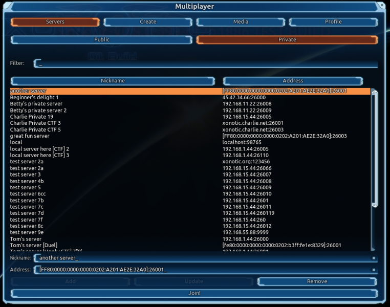
This new feature allows users to add private servers by their addresses, and they can be assigned a name for easier identification.
This is done in the Private tab under Server. (The Public Server tab looks the same as the current Server tab.) Users can sort by the nickname or the address.

There is an easy filter, too.

Sometimes you want to see just the servers on your same dorm floor.
 privateServers4.png
 (Size: 88.6 KB / Downloads: 276)
Of course you can add/update/remove the servers.
 privateServers3.png
 (Size: 71.44 KB / Downloads: 277)
Feedback
Right now I'm asking for feedback, review, and testing from the devs and the community.
These are some decisions I made:
1. Remove customizeable address bar from the Public Server Tab
I disabled the address bar editing capability in Public Server tab, to avoid duplicated function in adding custom address. If users want to add their own servers, they go to Private Server.
2. No game info for Private Servers
Unlike the public servers tab which provides rich information about gametype, players, etc., it's rather difficult to do so without modifying Darkplaces, which I think we should refrain from doing.
(I really hope I'm wrong here. Devs? Can I give Darkplaces an address and get the current game info back?)
It's a shame. On the other hand, some private servers don't respond to queries (it's a server setting), and most of the time, private game players have another way of communication.
3. Sacrificing a current feature potentially useful
From 1 and 2, note that currently, users can provide an address, add as Favorite (though there's a bug), and if the server is set to respond with game info, it will show in the server list. So this is a function taken taken out.
4. System-assisted duplication detection
This one sounds more complicated than it is. In Private Server list, each address (or domain name) must be unique. Users cannot add two entries with the same address. When user enters an address that exists, it enters the Update mode, in which the user can edit the nickname of the address. To edit the address of an existing server, the user can click on the server, give it a new address (system automatically switches to the Add mode), add it as a new server, and then remove the old server.
This makes managing the server list much easier.
Please help test it and provide feedback here. Thank you very much!
|
|
|
While I don't play on private servers, this does seem quite useful.
However, I'm not a big fan of adding a new row of buttons to the server tab, sacrificing space and clarity.
Considering that the server list is categorized, wouldn't it be possible to list the private servers in their own category (like the favorites)?
That shouldn't be confusing at all.
Another alternative would be to split the toplevel Multiplayer>Servers into Multiplayer>Public and Multiplayer>Private, though that might be too drastic.
|
|
|
Cool stuff Buddyfriendguy. 
|
|
|
06-13-2015, 02:36 PM
(This post was last modified: 06-13-2015, 03:41 PM by BuddyFriendGuy.)
Thanks a lot for the feedback, @sev and @SPLAT.
(06-13-2015, 04:43 AM)sev Wrote: Considering that the server list is categorized, wouldn't it be possible to list the private servers in their own category (like the favorites)?
That shouldn't be confusing at all.
You are absolutely right. That indeed was my first attempt. There are two challenges:
1. Not all private servers responds to direct queries (again, it's a server setting), i.e. some servers won't provide game info, so they won't show up in the list provided by Darkplaces.
2. Even if we could provide a place holder for these private servers, we still need to let the users edit the names. I was unable to come up with a sane UI design (which is not my forte) to serve both types of server. For example, shall we have a nickname dialog showing up when users provide a new address? And another edit button that becomes clickable only when users select a private server? Or put all these extra function in the Info... dialog?
I think your proposal would be an ideal design if we can over come the two challenges above. About point 1, perhaps @TimePath or somebody who can chip in about Darkplaces modification can help?. Point 2 should be solvable if somebody can help design it (draw mock-ups of the flow?).
(06-13-2015, 04:43 AM)sev Wrote: However, I'm not a big fan of adding a new row of buttons to the server tab, sacrificing space and clarity.
Another alternative would be to split the toplevel Multiplayer>Servers into Multiplayer>Public and Multiplayer>Private, though that might be too drastic.
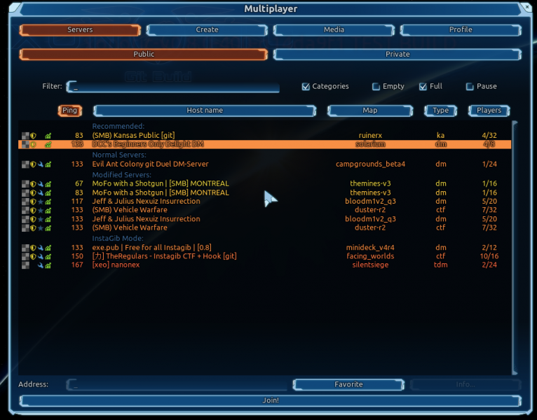
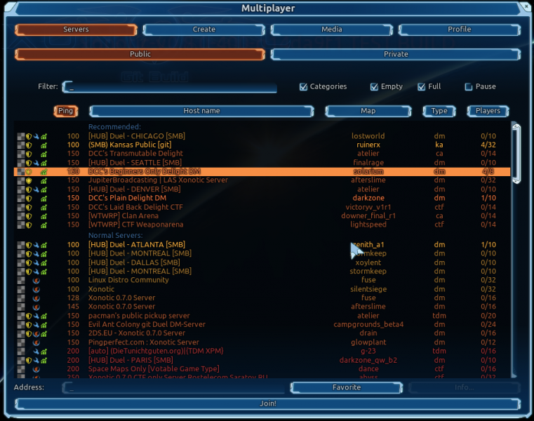
About space, under Media we already have another row of buttons for Demos, Screenshot, and Music, so this design isn't new. For Public servers, I usually have EMPTY filter enabled, so it only shows a few rows with players on it (I guess I'm not used to being the first player).
This is the one with empty server filtered:

This is the full list:

About clarity, my first reaction to your proposal was actually the opposite. I thought these two functions are very similar conceptually -- both are about joining a game on a server so it makes a lot of sense to be placed together. However, you got me thinking -- re-organizing the menu hierarchy sounds like a good idea.
Right now, under Multiplayer, we have Server, Create, Media, and Profile. I think Media and Profile shouldn't be under Multiplayer. I often try to find Profile in Settings. Something like this makes more sense to me:
Top: Single Player, Multiplayer, Media, Settings
Multiplayer: Public, Private, Create
Media: Demo, Screenshot, Music
Settings: Move Profile from Multiplayer to here. See details below.
There are a lot of 1st level sections in the Settings (Video, Effects, Audio, Game, Input, User, Misc, plus Profile), so I'd like a re-organization here, too:
Move effects under Video.
Delete User by doing the following:
Move User->menu skin and User->Language to Misc
Move User->Gore setting to Effects
So, we'll have in Settings:
Video, Audio, Game, Input, Profile, Misc
It is indeed drastic, but I just thought I'd second your proposal while I still have the beginner's eyes.
Thoughts?
|
|
|
(06-13-2015, 02:36 PM)BuddyFriendGuy Wrote: 1. Not all private servers responds to direct queries (again, it's a server setting), i.e. some servers won't provide game info, so they won't show up in the list provided by Darkplaces.
I'm not familiar with the code, but couldn't the serverlist insert the private servers at the appropriate place itself, without asking darkplaces? Even in a dedicated private serverlist, you would have to do that somehow.
(06-13-2015, 02:36 PM)BuddyFriendGuy Wrote: 2. Even if we could provide a place holder for these private servers, we still need to let the users edit the names. [...] For example, shall we have a nickname dialog showing up when users provide a new address?
Yes, how about a "Private Server" dialog. This is opened when the user provides an unknown address, or when a private server is selected and the user presses the "Info" button.
That way, you only need to add one additional button ("Add"), the rest stays the same and still makes sense:
![[Image: eENgJV4.png]](http://i.imgur.com/eENgJV4.png)
I agree that the menu partitioning is not ideal. However, you probably should start a new thread for that, and ask Mario and/or divVerent for their opinion.
|
|
|
06-15-2015, 12:40 AM
(This post was last modified: 06-15-2015, 12:44 AM by BuddyFriendGuy.)
(06-14-2015, 05:45 PM)sev Wrote: I agree that the menu partitioning is not ideal. However, you probably should start a new thread for that, and ask Mario and/or divVerent for their opinion.
Good point. Moved it to another thread.
(06-14-2015, 05:45 PM)sev Wrote: I'm not familiar with the code, but couldn't the serverlist insert the private servers at the appropriate place itself, without asking darkplaces? Even in a dedicated private serverlist, you would have to do that somehow.
Yes, I'm doing that now. My current dedicated private server list design does not rely on Darkplaces at all.
You are right: that's doable. It's just the complication of UI design and the required change of the current code (we are mixing two lists) that made me decided to separate the private server list from the public ones. Now that you are helping out, I can give it a second try.
(06-14-2015, 05:45 PM)sev Wrote: Yes, how about a "Private Server" dialog. This is opened when the user provides an unknown address, or when a private server is selected and the user presses the "Info" button.
That way, you only need to add one additional button ("Add"), the rest stays the same and still makes sense:
![[Image: eENgJV4.png]](http://i.imgur.com/eENgJV4.png)
Could you help me think through these points:
1. Remove Address Bar
I'm thinking to remove that address box since the Info dialog already has that info. How often does one need to know the address of a public server?
This way, users won't be confused and thinking that they can edit the address of a public server.
2. Edit function
How do users edit/remove a record? How about putting Edit/Remove buttons in the Info dialog, when users click it for a private server?
3. Duplication
What happens when users enters an address that's the same as public server? Do we allow that? I'm thinking yes. Here's a case for that: a server may switch between a public status and a private status (for example, a server may undergo testing and only opens to a small group of people during that time). In this case, if the user adds that server to the Private list, it will show up once when it's private (in the private server list), and twice when it's public (one in private list, one in public).
Honestly, to avoid duplicated records in the list is actually quite difficult. There are ways to resolve network address so we can know that a domain-name-based server and an IP-address-based server are the same one; and since each server has a unique ID, we can know an IPv4 address and an IPv6 address both point to the same server. However, it becomes complicated when a server's IP changes (DHCP, IP pool, etc.), or when two different servers use the same unique ID (admin's mistake). This was my primary motivation for separating the two lists altogether.
To sum up, I think we should do the following (the same as my current implementation):
a. disallow users to have duplicated addresses within the private list (I'll do just literal comparison on the address, so an IPv4 list and an IPv6 list and a domain-name listing of the same server will be 3 records; if users don't want to see all 3 records, then don't add all 3 info).
b. Do no checking for duplication between the private and public list.
4. Filter
To avoid confusion (since users won't see the addresses without going into Info dialog box), we won't let the users search the server by their addresses, as my current implementation allows.
5. Priority
Merging the two lists are harder to code, and will take more time. I wrote this current version to quickly solve a problem. I do want to keep improving it, and implement the ideal design you come up with, eventually. On the other hand, I have some other features that I'd like to add to Xonotic. For example, I'd like to add a Gallery menu to explain each weapon/item.
Shall we merge the current design (separate tabs) to the master first, so users can start benefiting from it, while we keep implementing your design (which I myself like better as well)?
Or shall we do it right from the beginning?
|
|
|
(06-15-2015, 12:40 AM)BuddyFriendGuy Wrote: 1. Remove Address Bar
I'm thinking to remove that address box since the Info dialog already has that info. How often does one need to know the address of a public server?
My idea was this:
When the user inserts an address, clicks "Add", and the server shares information, it is added to the "Private" section with the info provided by the server.
When the user inserts an address, clicks "Add", and the server does not share information, the "Private Server" dialog is opened where the user can insert custom values.
Without the address box, this would be more complicated.
Or do all private records ignore the (possible) info from the servers and just display the custom values? In that case, the address box could be removed.
(06-15-2015, 12:40 AM)BuddyFriendGuy Wrote: 2. Edit function
How do users edit/remove a record? How about putting Edit/Remove buttons in the Info dialog, when users click it for a private server?
Edit: Click on the "Info" button, which opens the editable "Private Server" dialog (same dialog as for the "Add" button)
Remove: When a record is selected, the "Add" button changes to a "Remove" button. Alternatively, you could add a dedicated "Remove" button next to "Add".
(06-15-2015, 12:40 AM)BuddyFriendGuy Wrote: 3. Duplication
What happens when users enters an address that's the same as public server? Do we allow that? I'm thinking yes.
I agree. The user is responsible for entries in the private list. Don't want duplicates? Don't add duplicates.
(06-15-2015, 12:40 AM)BuddyFriendGuy Wrote: 5. Priority
Shall we merge the current design (separate tabs) to the master first, so users can start benefiting from it [...]?
This is up to you as the implementor. Personally, I would wait until the design is finished.
Though it should be no problem to update it later, so this question ultimately has to be answered by the repo maintainers.
|
|
|
Just wanted to say that this sounda like a very useful feature +1
|
|
|
Thanks @machine for the support.
@sev, I'll do some experiment and update later. Thanks a lot for the feedback.
(06-15-2015, 05:41 AM)sev Wrote: Edit: Click on the "Info" button, which opens the editable "Private Server" dialog (same dialog as for the "Add" button)
Remove: When a record is selected, the "Add" button changes to a "Remove" button. Alternatively, you could add a dedicated "Remove" button next to "Add".
Adding a dedicated Remove button probably makes more sense. Otherwise, when a record is selected (one record must be selected all the time), and the users want to add a record, they'll have to click on a public server for the ADD button to re-appear. That's a bit confusing.
|
|
|
You can use the plus and minus symbols for the add/remove buttons, that results in nicely short square shaped, universally understood buttons.
You have a lot of useful ideas, BuddyFriendGuy - and fortunately also the capabilities to implement them!
|
|
|
(06-15-2015, 09:02 PM)BuddyFriendGuy Wrote: Adding a dedicated Remove button probably makes more sense. Otherwise, when a record is selected (one record must be selected all the time), and the users want to add a record, they'll have to click on a public server for the ADD button to re-appear.
You are absolutely right, I didn't think of that.
(06-16-2015, 02:45 AM)Halogene Wrote: You can use the plus and minus symbols for the add/remove buttons, that results in nicely short square shaped, universally understood buttons.
I like this idea.
|
|
|
Love it, been waiting for a such feature! I'am basically only playing on "private" servs and stuff so ye, really do love it 
|
|
|
Just chiming in to say great idea +1
|
|
|
Thanks everyone for your valuable input and feedback! The current branch (see the first post for the link) has 100% working code, intended for merging, so you can use it for now. @sev's suggestions for improvement are on my TODO, but I'm spreading a bit too thin now, so it'll be a while.
Caveat: My implementation saves all the private server's addresses in a variable in config.cfg. @divVerent told me that all files except for the private key in ~/.xonotic/ are readable by the servers, so there's no easy way to keep those addresses from servers. (Maybe we can encrypt it with the public key, and require the private key to decrypt it, but I doubt it's worth the coding effort.)
|
|
|
One thing id like to see is a indicator for online status.
For private/favorite listings there should be a simple icon identifying if its online at a glance.
-----
Also i prefer the original (separate tabs) i find it much easier, to quickly and easily go to a 'preferred' server. Rather than scrolling through the public list till im at my 'favorites' and then making a decision if i want to join any of them(empty/not online). Only to have to scroll up again to see if anyone is playing on a publicly listed server.
So the separate tabs is far more convenient and useful.(i also think its more UI friendly.)
---------------
as far as mode options on offline/no_response add's. 'other' should be listed for custom mods, legacy and nexuiz support.
---------------
as well, the general address bar, i think it should toggle-able or atleast a radio button. dedicated bar takes up quite a bit of screen space low-res, and takes away from a cleaner UI.
|
|
|
Thanks, @kingtiger01, for your valuable input.
The online status of private servers is not always available since not all servers respond to ping when they are set to the private mode. Also, it's actually quite tricky to do that, given the current engine design (it only polls the public servers, and favorites; to add private servers will require changing the engine).
Do you think you can make a rough mock up to demonstrate your idea visually?
I'll have more time in the summer to implement it.
|
|
|
(01-04-2016, 04:23 PM)BuddyFriendGuy Wrote: Do you think you can make a rough mock up to demonstrate your idea visually?
I would but i have no idea how X_X.
|
|
|
01-07-2016, 08:05 AM
(This post was last modified: 01-07-2016, 08:05 AM by BuddyFriendGuy.)
Oh, just draw on paper with a pen, and then take a photo to upload here.
|
|


 privateServers4.png (Size: 88.6 KB / Downloads: 276)
 privateServers3.png (Size: 71.44 KB / Downloads: 277)
 privateServers4.png (Size: 88.6 KB / Downloads: 276)
 privateServers3.png (Size: 71.44 KB / Downloads: 277)


![[Image: 38443.png]](http://stats.xonotic.org/static/badges/38443.png)
![[Image: eENgJV4.png]](http://i.imgur.com/eENgJV4.png)

![[Image: 5801.png]](http://stats.xonotic.org/static/badges/5801.png)