Create an account


Thread Rating:
  • 0 Vote(s) - 0 Average
  • 1
  • 2
  • 3
  • 4
  • 5
[DM] - Epsilon Facility

#1
There  hasn't been much more feedback to consider, and I'm mostly working on new maps these days so I think it's time to call this one done Smile.

map-epsilon.pk3


Final Release
 - Added a couple of portal hints for performance.

Beta 5 - Changes
- Raised ceiling for 2nd level in cooling room
- Removed mega-armour, replaced it with a 50 armour towards the far end of the yard (where the Hagar and 50hp were)
- Hagar moved to where the mega-armour was
- Nex has been moved up to replace the Devastator
- Tweaked shard placement.
- Added control points to support Domination
- Enabled a few more gametypes in the mapinfo
- .map file and GPLv2 license now included in the .pk3

Beta 4 - Changes
- Added back a handful of crates + an angled ledge to allow trickjumping up to the upper deck area from the stairs room.
- Megahealth now located in the underwater chamber, much riskier to go for.
- Far end of the yard area now has some crates for cover.
- Re-arranged weapons and items to see if this works better for balance reasons.
- Tweaked some doorways / passages to streamline movement.
- Alcove above the stairs has been redone with a much nicer visual feel
- Several other bits of visual flair added around the level.
- Strip lighting now uses surfacelights for a more consistent lighting effect.
- Some odd cleanups.

Beta 3 - Changes
- Removed the crates under the stairs.
- Added a sound effect to the warp zones.
- Explicitly placed the map under GPLv2 license.
- Uploaded the map source to GitHub (https://github.com/AdamLuchjenbroers/map-epsilon)

Beta 2 - Changes
- All light alcoves now full-clipped
- Under large stairs area now filled with crates
- Under small stairs area now clipped off
- Above ramparts in the yard is now clipped off.
- Removed a lot of excess ammo / health items.
- Arc relocated to old MG site
- MG removed.
- Window area appearance has been significantly changed.
- Power Room -> Mega Armour corridor widened.
- Roof of both tunnel side areas has been raised.
- Added plinths or other decoration for weapon, MH and MA locations.
- Window cover added to Yard -> MA Corridor.
- Some additional decoration / trim added to yard area.
- Added additional gametypes to .mapinfo

Would love reviews / comments / suggestions.


Attached Files
.pk3   map-epsilon-beta5.pk3 (Size: 941.86 KB / Downloads: 16)
Reply

#2
Actually the Maps section is correct, the sticked posted is really old. :O I'll move it.
Reply

#3
Screenshots of the map would be really nice!
My Xonstats Profile
Latest track on soundcloud: Farewell - to a better Place (piano improvisation)
New to Xonotic? Check out the Newbie Corner!

Reply

#4
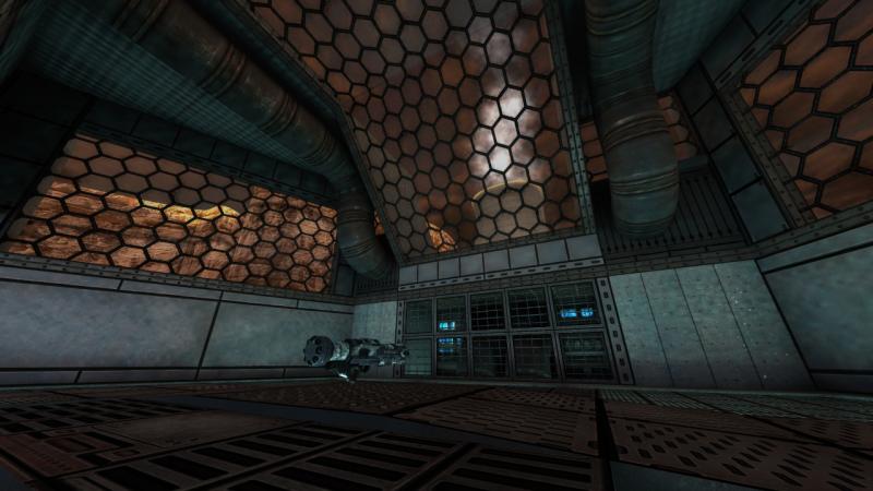
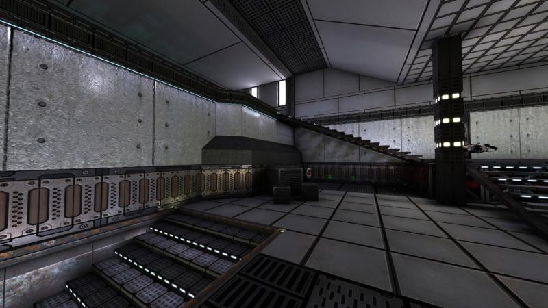
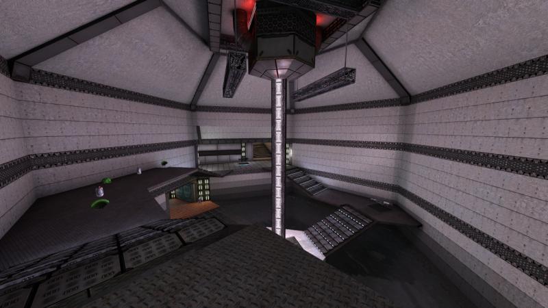
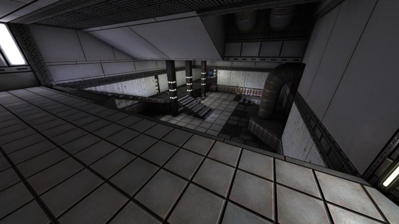
I'm just converting a few to thumbnails (The full size shots are at 4k, so I suspect the admins would frown on me uploading those).

And, a few more screenshots:


.jpg   thumb007.jpg (Size: 49.74 KB / Downloads: 559)
.jpg   thumb001.jpg (Size: 49.36 KB / Downloads: 403)

.jpg   thumb003.jpg (Size: 49.87 KB / Downloads: 400)
.jpg   thumb006.jpg (Size: 52.65 KB / Downloads: 419)
Reply

#5
Spend some time running around, looks nice for DM and maybe CA too!
  • Some rooms/hallways feel cramped and could use a bigger scale I guess.
  • In this hallway http://forums.xonotic.org/attachment.php?aid=1600 you could use the glassx texture on the roof, because it looks like you should be able to jump through.
  • A LOT of ammo.
  • What about a Strength? Big Grin Eventually in the water part between the 25 HPs.
  • No Devastator (Rocket Launcher) is intentional?

We'll put this map asap onto the [WTWRP] Deathmatch server. Smile
Reply

#6
Those images look really nice, good job on lighting! I will try to have a look at it once I find some time to do so.
My Xonstats Profile
Latest track on soundcloud: Farewell - to a better Place (piano improvisation)
New to Xonotic? Check out the Newbie Corner!

Reply

#7
Hmm, should there be more glassx textures in the list then hexglass? I'd like to put a glass cover over the top but for some reason that's the only one I've got (and it really didn't feel like the right texture for that part of the map)

Are you saying there's too much ammo or not enough?

I'd be very interested to hear what people think about the upper floor from a strategy perspective. Because it gives higher ground over two of the three rooms I've held off putting too many goodies up there. If I've overestimated it as a position I'm sure I can re-arrange items around a bit to fit a Devastator in Smile.
Reply

#8
I've been running around the map a little bit in a local game. I have to say that I like this map. The size is good and would probably also work for duel.
However, I see some (minor) problems:

1. Trickjumps: While this is not really neccessary for dm, it's always nice to have a few. Maybe add a crate near the stairs out of the room in your 4th screenshot, so that ppl can jump to the higher level without using the stairs to the mortar.

2. Items and ammo: There are quite a bunch of health and armor shards. In my opinion, there are too many. It's the same with ammo. Next to each weapon, there is at least one ammo pack. I don't think one will ever run out of ammo on this map. With vortex and arc being so close to another, you can get the max of 180 cells in a few seconds. Imo, one or two ammo packs for each type would be enough for the size of the map.
Also, since the arc is supposed to replace mg one day, I don't think you should put both into the same map. On the other hand, there is no Rocket launcher (which might be a good thing).

3. Clips: There are several indented areas in several walls like behind the mortar. While they are visually appealing, they are very annoying gameplay wise. I think these should be clipped, so that mortar/crylink have predictable bounces.
Also, you can hide/camp on the doorframe near the arc.

4. MG "room": This area is very empty. I think it needs some structure like one or two pillars. It might also be a good place to put strength or shield.

5. License and Source: Not really neccessary, but always nice to have. Since Xonotic is open source, it would be fitting that custom maps are also open source. But in the end, that's your decision.

Overall a good map, I guess I will add it to the EAC servers
Reply

#9
I think some corridors feel too small. If you jump and your head bumps to the ceiling then I think that's too small.

[Image: attachment.php?aid=1601]

You can also go below the stairs shown on right on this screenshot. There's no benefit to going in there as it does not shield from splash damage and your projectiles can barely fit through anything. Might as well clip it off so you don't by some miraculous accident get stuck there in midst of a fight.

I kinda like that you can jump over the lamps or whatever those things at the center were up in the ceiling. Seems like a viable ambush spot for people timing for mega health.

I second freddy's point about ARC and MG being both there. MG is outdated, it's time to start shoving Arcs into maps.
Reply

#10
It looks like a good map for some DM action, I really like the Mega Health room.
Nice work with textures.

You could also add a minimap on your PK3 (should be in a gfx/ subfolder), it's always useful.

@Smilecythe: I would recommend keeping the MG instead of the Arc here ; isn't the Arc currently overpowered?
Reply

#11
(06-23-2016, 03:59 AM)SpiKe! Wrote: isn't the Arc currently overpowered?
As far as primary fire goes, I would argue no. Secondary fire is stronger, but if you time your shot wrong, you'll be wasting a lot of ammo and time. Every weapon is overpowered in a way or another if your opponent doesn't understand it's weaknesses and advantages. I don't like the secondary, but that's no reason to not have it on maps. I absolutely loathe Crylink, yet it is on almost every map.
Reply

#12
(06-23-2016, 03:59 AM)SpiKe! Wrote: You could also add a minimap on your PK3 (should be in a gfx/ subfolder), it's always useful.

I'll definitely look into that, is there a tool people use to make these or are they all made manually?

Also, I'm trying to decide whether to replace MG with Arc and put the Devastator where the Arc currently is. Thoughts?
Reply

#13
Minimap is generated automatically when building a "final" release, or you can compile it separately from NetRadiant's Build menu (the Single -minimap option).

As for Arc; when the Machine Gun is removed, its spawn points will probably be replaced with Arc spawns, so it would be wise not to include both weapons in your map.
[Image: 230.jpg]
Reply

#14
(06-23-2016, 08:20 PM)Notavi Wrote:
(06-23-2016, 03:59 AM)SpiKe! Wrote: You could also add a minimap on your PK3 (should be in a gfx/ subfolder), it's always useful.

I'll definitely look into that, is there a tool people use to make these or are they all made manually?

Also, I'm trying to decide whether to replace MG with Arc and put the Devastator where the Arc currently is. Thoughts?

The Devastator would be very close to the Vortex (right now already Arc-Vortex), that's not so great. If you find a way to get same kind of distance between all three guns would be best I guess (triangle).

Apparantly in the Arc room is a way to jump "outside" onto the roof.
Halogene found it and can maybe elaborate more. Wink

Also please add modes like FT, CA, TDM, KH to your mapinfo so they're playable. They don't need any modification to the map.

We played it in CA yesterday: http://stats.xonotic.org/game/698258
Warpzone is great. Big Grin Edit: You could add a sound to the warpzone if you want to. See Final Rage, Cucumber or Bromine how it's done or looks/sounds like.
Reply

#15
Oh, it was quite easy actually - you can jump onto the prisma shaped thing on top of the wall that is in direction of the tunnel. From there you can go on top of the tunnel. You might have to crouch to get onto the thing, I don't remember, but I think it works without.
My Xonstats Profile
Latest track on soundcloud: Farewell - to a better Place (piano improvisation)
New to Xonotic? Check out the Newbie Corner!

Reply

#16
Here's my ingame review in a form of demo: https://www.dropbox.com/s/9x1vzfc709jpku...n.dem?dl=0

It's true that if you put ammo boxes next to it's parent weapon or weapons with the same ammo type side by side, you kinda cheapen the layout. Those ammos could be placed somewhere that has nothing else in it, so that the benefit of going there would be to get ammo thus making that portion of the map useful. Same works for weapons and armor/health. Distributing items evenly around the map helps to balance portions of the map by their purposefulness. This kind of balancing I sincerely recommend. Try to imagine how you would go around collecting resources in your map. Also try to force the player into making decisions. If going through one route gives you everything that you need then I think it's lazily designed. However, there are indeed maps that turn out just fine even with a seemingly horrible item distribution, see Downer or Bloodrun (before somebody fucked it up with overly balanced QL scheme).

Edit: Random idea, what if you moved mega health to under water center where those 25 healths are? I don't think people would otherwise ever get in there by spontaneous choice. Risky mega healths/armors always make up nice gameplay.
Reply

#17
Beta 2 posted Smile A lot of clipping added, mg removed, arc relocated and a lot of ammo removed (more detailed change list in original post).
Reply

#18
this looks really nice!!

really nice lighting!
Reply

#19
I'm hosting this on BuddyFriendGuy Fun Server for testing.
Reply

#20
So updated to beta3. The changes from beta2 are mostly small tweaks and improvements, plus explicitly placing the map under GPLv2 license.
Reply

#21
Beta 4 now posted. I've re-arranged the items to see if this gives a better balance (MH now under the water, and weapons have been re-arranged a bit with a few added).
Very interested in hearing how this item setup works / doesn't work compared to the previous one.

Anyhow - here's two more screenshots that didn't fit into the first post:
       
Reply

#22
Ok, so the main thing I think I really need to refine on this map is the item placement. So I'm very interested in hearing about how it plays and how the current setup is working / not working.
I'll have to see if I can join you all for a game sometime on it, though the fact that I'm in a different hemisphere is going to make that difficult (and ensure that at least one of us has to suffer a 250-300ms ping time :/ )
Reply

#23
Beta 5 is out, with a few refinements to item placement. Still debating whether I should swap the Hagar and Arc locations but otherwise feeling pretty good about the new setup. Interested to hear how it's working out for anyone who gets a chance to playtest it Big Grin
Reply

#24
It's good can't argue with item placement. Switching arc and hagar doesn't seem that necessary except it would swap the ammo income. Also I like how you smoothed some corners like the door from hagar to mega-health room.

For domination I'd try a 4th control point near the crylink or somewhere moe centered because at the moment you can capture all in a smooth round counter-clockwise. It's no bad thing but bringing one in the middle would require people to not just run in a circle while ignoring the middle.
But bringing one to the crylink could make it too easy to get from nex-cp to crylink-cp via warpzone.
Reply

#25
Ammo income / cycling ammo types would be the main reason to swap them Smile Going arc -> nex -> electro can net someone a lot of cells. Just undecided whether that's really a problem to be solved.
Reply


Possibly Related Threads…
Thread Author Replies Views Last Post
  [Map] Facility 114 (WIP) Moo 32 37,360 11-27-2010, 12:19 PM
Last Post: Cortez666

Forum Jump:


Users browsing this thread:
1 Guest(s)

Forum software by © MyBB original theme © iAndrew 2016, remixed by -z-