Create an account


Thread Rating:
  • 0 Vote(s) - 0 Average
  • 1
  • 2
  • 3
  • 4
  • 5
wink [alpha]

#1
4 u SleepyHeartHeartHeart


download Big Grin

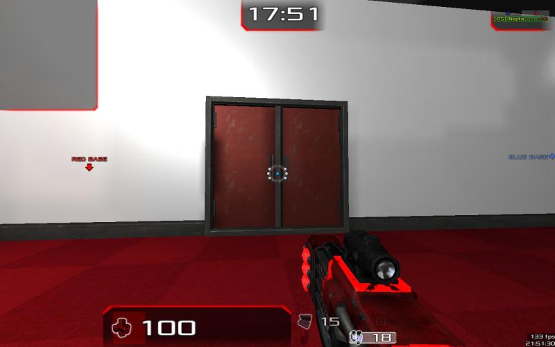
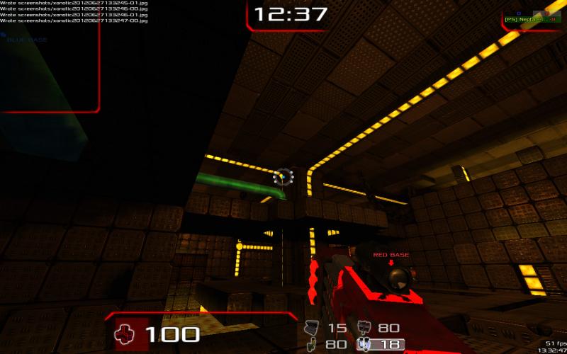
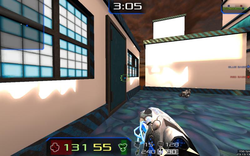
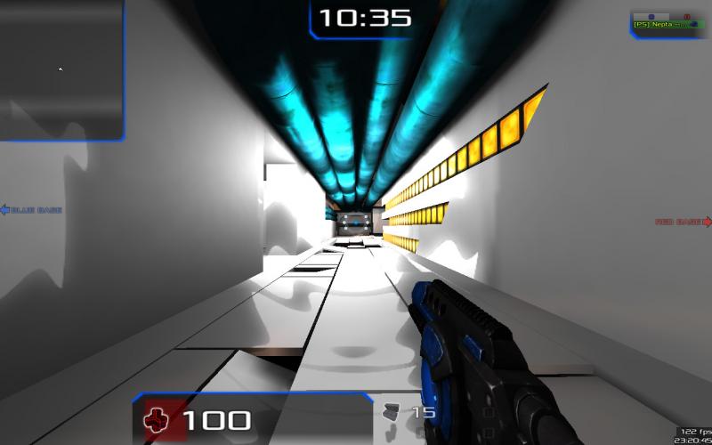
I am working on this for the competition ... it still needs detail work ... but the base map is done

for those of you who are wondering ... this is a continuation of the pyipelab map I made for my planet woune thing

and yes I will make better cubemaps for the final release
Reply

#2
That last room looks sweeeeet! Big Grin
Reply

#3
It's very obvious you are getting better and better at mapping, continue that way Smile
Reply

#4
if someone could please try the map .. I need to know if it plays well ...
Reply

#5
I can do that today! :-)

Visuals: Almost perfect
Weapons and items placement: Items got okey placement, but the weapon placement isent really my preference.
Gameplay: I did only play with bots, but so far it plays pretty good! I really like the idea of adding those turrets on the top of the map. I don't think that the HLAC will work well since it's quite unbalanced IMO. I saw that a Port-o-launcher spawned but I couldnt find it, also an interesting idea. But it might get the map quite unbalanced, I do not know for sure though.

What I like the most: The visuals, the small tubes you can laser jump up in, I like the turrets on the top of the map.

What I would like to be changed: Make a city skybox instead, it doesnt feel like this map is floating in space. Weapons placement. I would like to get the HLAC replaced and maybe the Port-o-laucnher depending on how it effect the balance. Also I don't like the idea of laser jumping on the roof and when be able to jump into the void, it doesnt feel like it fits in this map.

Overall I like it, great job! Smile
Reply

#6
I'm speaking strictly from gameplay perspective, but I'm not too enthusiastic unfortunately.
-Incredibly bloomy outside give an eyesore. I think I prefer augenkrebs to that :E
-Many movement disrupting/altering zones which look like fun on paper but get annoying in practice (think hyperspace)
-Weapon placement is pretty awkward for a fast paced game (it would work well if it was CoD or CS-like game). Those buildings do encourage CoD like gameplay as well.
-What's up with those tesla coils on top?

Overall, looks more like a proof-of-concept for an engine to me rather than sth I'd actually love to play on a server.

BTW is it just me or port-o itself is damn near useless with that 30s timeout? I'd think it'd be better for it to work like a jetpack and maybe share fuel between hook, jetpack and porto.
Reply

#7
ok thanks for the feedback

-- the turrets are so people cant hop across the roof ... I could put in an invisible ceiling if you wish ... but I hear people dont like those ...

-- hmm ... I never played it with bloom on ... I'll need to check that ...

-- bot support ... dang I forgot it ... shame on me .. Sad ... I'll be sure to put it in the next version

-- skybox is on my todo list ... they are pretty difficult to make
... fog for the bottom of the pillar too

-- "Many movement disrupting/altering zones" ?? could you be more specific ... do you mean that one sideways warpzone? ... I dont force you to use it ... there a regular one nearby ... or do you just mean right angles...

--as for weapon placement --- I see what you mean ... i'll move them to more central places (as opposed to corners) ...

-- buildings ... I'm not sure what to do with them ... I want people to be able to go inside (some) of them ... otherwise its the typical video game city where every door is locked ... I'm not sure if there is any way to do that in a "fast paced" fashion ... ...

-- HLAC is staying ... I can move it ... but it will always be on the map ... somewhere (and how is it unbalanced?)

-- I though the porto was accessable ... maybe I messed something up -- and for its timelimit ... i agree ... that is something you would have to talk to the devs about ...

--"proof-of-concept for an engine" ?? im still using darkplaces ... do you mean that it feel like a different kind of game? ... I don't think I did anything that revolutionary ... I though it played like redplanet ...


if anyone else wants to try it out ... I am always welcome for more feedback
Reply

#8
Don't take away the turrets! (they're awesome and also make the map stand out from the rest) Smile

Thanks for moving the weapons, that will improve the gameplay a lot!

If the HLAC is staying, then no need to move it. Why I think it is unbalanced is beucase it's too OP in my opinion and requires no aim.
I also don't like the weapons model, it's ugly
:-P..


As for the buildings, I get you want them to not be this common boring locked buildings you see in lots of games. But I think you should move some of the weapons and items out of there to keep the gameplay fast as Xonotic is meant to be.
Reply

#9
ok ... I'll try to keep the important stuff out of the buildings (probably most will have windows ... but you cant go in (think the peep shows in lightspeed))

I'm unsure about the RL placement in the only building you can go in atm ... that building is meant for keeping tabs on (and the enemys paws off) of the nex ... If someone shoots a rocket out of the window the turret will likely arc/bounce lighting too the rocket and then too the player ... usually resulting in an interesting death ...

HLAC wise ... I disagree with you ... however ... I'm not going to turn this into another balance thread ...


weapons/powerups -- currently there is

--crylink
--electro (only one in the map atm ... I forgot to put one on one of the sides)
--mortar
--HLAC
--nex (on the highly visible bobbing/floating island)
--uzi (will swap with lg once developed)
--porto
--RL (in the building)
--shield (have you found it yet? Wink )


--- guns omitted ---
--hagar
--rifle
--seeker
--minelayer (i think ill put that in somewhere ... tha map would work well with it)
--fireball
--hook
--laser (pickup version)
--shotgun (pickup version)
--minsta
--tuba
--strength (im not gona have both strength and shield ... that would be ridiculous )
--jetpack (map is too small for it)


any thoughts?
Reply

#10
Okey, the RL death thing, nice Smile keep that it was a fun death. This map is also quite open so the nex will be the most useful gun anyway. As you said for the mine layer, it would fit in great I love ctf maps with these kinds of guns in it. Big Grin

Can't wait to try it!
Reply

#11
I've tried all of the maps in the contest in the crimsaq server and this was the one that gave me the lowest fps.
I had around 50fps most of the time.

The second lowest map was my map with 150fps in some places (i will fix that in next version) and the rest gave me more than 200fps

Also, the bright rooms hurts my eyes!!! But that is not a problem, i don't mind it, the thing is, what has to do a bright room with the outside and the room with big chains?
They look nice but i'm not feeling consistency. Take for example the spider map, its all about the dark feeling of spiders or whatever, but here i feel that they are 3 completely different maps in one.
Reply

#12
3 major things need fixing:
  • Framerate
  • Bloom (WOAH!)
  • Low quality snow textures and lack of variety in the use of textures

Also, it's hard to distinguish between glass and no glass when up in the tower, maybe you could change the opacity or something...

Other than that, I like the overall feel and complexity. Could be something special.
Reply

#13
ok ...
this is an older thead ... for anyone reading this who is confused ... here is the link to the map we are talking about
http://ubuntuone.com/1VVVeiv2dbfHNmGTLmCPSo


issues ...

should be noted that the end of this was rushed in a 5 hour mapping spree before the contest ended ... I ran out of time to make it how I wanted it Sad

framerate ... it was silkysmooth till I added snow ... and fog ... it was down to 1 fps for a while ... so be happy that it even breaks 100 ... I am also trying to find away to make the snow be less of an issue ... however being a mid size box map ... its kinda hard to do that ...

bloom ... its snow ... I don't know how to fix that

glass ... I'm using trak5 glass ... I am planning on switching to something better

consistency ... I couldn't agree with you more ... consistency is a major issue right now ... And I plan on fixing it ... once I figure out how ...

also ... I know the snow texture is kinda lame ... too

...............

these bugs (and others like red stuff on the blue side) are the reason why I haven't posted the map here yet ...

dont let that discouraging you from voting for it though ...
Reply

#14
I generally liked the construction of the map, but it really feels unfinished. Especially if anyone goes outside of the main areas (like the roof of the building, which is normally accessible with a few laser jumps - it's all white!). Anyway I think that when you finish it, polish & optimize, it'll be a really fun map.
My contributions to Xonotic: talking in the forum, talking some more, talking a bit in the irc, talking in the forum again, XSkie
Reply

#15
yay ... currently I am developing a whole new texture pack for the map (and the rest of xonotic as well ) ... I will test it on a smaller duel map ... then move the textures over to wink .......


dont expect anything anytime soon though ... it will take a while
Reply

#16
smaller duel map which ofcourse will be made for the new contest http://forums.xonotic.org/showthread.php?tid=3438 !
I don't like the acces to the roof,
the map performance as previously mentioned is extremly low,
There are 'bumpy' stairs inside the building that bumps you right into the doorframe. -fix it!
Some of the rooms are completly white and shiny, it might be a bit confusing, but most of all it doesn't look good

What is incredibly good is the slime room and all these effects in it, chains swinging there and there, moving textures...
I like the tower idea (made of simple rames and glass) though there are some holes in the glass you akwarldy cannot pass through. Why?
Also the elevator leading to the top of the map: Its easy to get up, but what if you changed your mind and want to get down? if you try that the lift gets you up again and again, untill you ragequit.

The outside is generally good, I don't see a point of making invisible warpzones in the debris though. Great job with ruins and stuff.
Im glad you re making new texture set.

Take part in duel map contest!
Reply

#17
no its not for the new mapping contest .... for 2 reasons

1 ... I need a break from contests for a bit ... too much stress from the last one (and 0 votes to show for it )
2 ... I can't use the prize ... If I would win this new contest I wouldn't want to take the prize away from someone who could actually use it ... that would be mean

anyways ...

I'll put wink back on the back burner .... again ...

...
..
.


I hate making big symmetrical ctf maps D:
Reply

#18
A cft map doesn't need to be symmetrical, it's just that making a symmetrical map is the easiest way to ensure that both teams have the same chances. I've seen some good nonsymmetrical ctf maps though (for UT).
My contributions to Xonotic: talking in the forum, talking some more, talking a bit in the irc, talking in the forum again, XSkie
Reply

#19
(08-30-2012, 10:34 PM)hutty Wrote: I hate making big symmetrical ctf maps D:

This.
Exactly this!

Thanks for that attitude man.
[Image: Sigsig.jpg]
Reply


Possibly Related Threads…
Thread Author Replies Views Last Post
  [MAP-ALPHA] revctf1 (maybe?) - AKA The Well Revenant 8 8,242 08-05-2024, 06:57 AM
Last Post: Mario
  map - THAD ( alpha 1 ) Strahlemann 26 24,519 08-05-2024, 06:29 AM
Last Post: Mario
  hazard alpha machine! 7 7,860 07-02-2013, 01:15 PM
Last Post: Justin
  [WIP-MAP] Facing Worlds Evolved [Alpha 2] _para 16 23,164 05-12-2013, 03:28 PM
Last Post: Justin
  Digsyite alpha hutty 6 6,063 05-23-2012, 09:13 AM
Last Post: hutty

Forum Jump:


Users browsing this thread:
3 Guest(s)

Forum software by © MyBB original theme © iAndrew 2016, remixed by -z-