Create an account


Thread Rating:
  • 0 Vote(s) - 0 Average
  • 1
  • 2
  • 3
  • 4
  • 5
[QM] Roist

#1
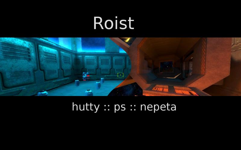
[QM] = Quick map ...

I was bored this afternoon ... and decided to see how far I could get on making a duel map ...
... turns out I could pretty much finish one

space map ... half indoors ...
mostly exx (rusty metal) textures
some patch mesh terrain :3

there a hidden hlac (try to find it without pushing the hlac button)
oh ... and getting the nex is a challenge too


link

currently available on the Paradox Space duel server
   
Reply

#2
Oh, nice screenie, I'll try it in 10 min! Smile

EDIT: I didnt have to time to play it much, but i tested it, it seems a little bit too big for duels and too many items for that IMO, but I think this works great with FFA. I have to try it more though to give more feedback.
Reply

#3
well ... dont worry about it too much ... I spent absolutely no time planning the layout ahead of time ... I just planned it out as I went along
Reply

#4
roist0008.pk3 contains roist0007.bsp and roist0008.bsp but only one of them (0008) has .mapinfo and .jpg.

I will try to give proper feedback soon.
Reply

#5
fixed....
Reply

#6
I wasen't sure if you saw what I said on irc:

* Less health and armor on the map
* Mortar and RL have to be longer from eachother
* Maybe move MA to the buttom in the RL room or at least make the room it is currently smaller
* Making it a bit smaller, not in scale but maybe remove some platforms or a room.
* Making the HLAC place easier to get into or remove it
* Maybe making it easier or more obvious how to get the Nexgun

That's all, but as it is now I think it would be really fun FFA map! Smile
Reply

#7
the map is done quickly so it obviously doesn't look detailed, but the overall aesthetic is really nice, mainly I like it because it makes me nostalgia for the first stages of metroid prime.

some bits don't look good at all or make any sense though.

details here: http://imgur.com/a/356iO
Reply

#8
I.ve noticed there is only one spawn point ...
Would be nice when you change that.

GreetZ Su
Reply

#9
yeah ... one I forgot to add more spawns ... Tongue (again)

the loading bay window doesn't make any sense because I made the room with the window first ....

...

anyways ... seeing as it was just a quick map ... I'll fix the killer bugs ... an then leave it alone

(if someone else like it they can expand upon it)
Reply

#10
exx

Looks quite good... and big, I'd say. The styles are also very mixed, but i am not sure if that is bad or good, so it is up to you to make any conclusions.

Also, what does "nepeta" means?

Healthandarmor is very massed and focused... I mean too much of it and too close together. Also too much weapons for such a map. Also, maps with one spawn and no bot waypoints sux.
[Image: 0_e8735_c58a251e_orig]
Reply

#11
(11-06-2012, 11:45 AM)aa Wrote: Also, what does "nepeta" means?

It's a troll and also hutty's clan name. Smile
Reply

#12
[Image: 4oWAMxbc0U7p7nBq4XYUSI]

:3
...

[Image: 4LHtsUrRmBM9O9elMyBAKg]

Anyways ... I took it off the server ... rather than fixing it .. I will figure out a "good" duel map layout ... and then use the same style for that ...

It would probably end up similar (gameplay wise) to the yard ... or evilspace
Reply


Forum Jump:


Users browsing this thread:
2 Guest(s)

Forum software by © MyBB original theme © iAndrew 2016, remixed by -z-