|
|
I started working on a new texture set. I even have a name this time!
Alien Craft
http://i246.photobucket.com/albums/gg86/...ation1.jpg
I am planning on having this texture set be more organic and colorful.
let me know what you think, I am not yet set on any specific style.
also, how do you get it to display the miniature version?
|
|
|
bone_v1

I don't know if it will work with Xonotic (built with the NetRadiant that came with Nexuiz) but uses only "common" textures so it might. If you think its worth it I'll start another thread with the pk3 
Supports DM, TDM, CTF, LMS, RUNE, KH, DOM, ONS and ARENA.

|
|
|
(10-09-2010, 11:13 AM)Rad Ished Wrote: [PIC]
Seen on an random Nexuiz server. zOMG Interstellar poultry!
|
|
|
tests with terrain
![[Image: dm-212871740914.png]](http://img.xonotic.org/dm-212871740914.png)
somewhere
|
|
|
whoah. that's nice 
you should try and get the q3map_SurfaceModel to work, to get some nice plants or something.
http://q3map2.everyonelookbusy.net/shade...rfacemodel
|
|
|
Looks Incredible!
![[Image: 542.png]](http://stats.xonotic.org/static/badges/542.png)
#deathmatchers @ irc.quakenet.org
|
|
|
It's only terrain made with terrain editor (FATE) and terrain01x/blends-mars-rock01-ground01 shader (long name!)
Thanks Shadow, I didn't hear about q3map_surfacemodel
After some fails like this:
![[Image: dm-1312872606293.png]](http://img.xonotic.org/dm-1312872606293.png)
I got something more interesting:
![[Image: dm-1112872606568.png]](http://img.xonotic.org/dm-1112872606568.png)
(yeah, grass in Mars....)
somewhere
|
|
|
haha. apparently img.xonotic.org is malware now. and those links appear to be broken (unless my interne is just totally fraked.)
|
|
|
10-17-2010, 04:45 AM
(This post was last modified: 10-17-2010, 04:52 AM by CuBe0wL.)
Started working on a new map.
Those who'd like to check out the progress, it's in git: cbrutail/map-fanatic
Plans:
![[Image: 97qgoeugtiu9cvnneop0_thumb.jpg]](http://pics.nexuizninjaz.com/images/97qgoeugtiu9cvnneop0_thumb.jpg)
First I wanted to go with a rusty, industrial style, but I've changed my mind. Also, I wanted to try something new.
![[Image: h39bz88g77q3vebk3e_thumb.jpg]](http://pics.nexuizninjaz.com/images/h39bz88g77q3vebk3e_thumb.jpg) ![[Image: 57izertyn6hz15hycc_thumb.jpg]](http://pics.nexuizninjaz.com/images/57izertyn6hz15hycc_thumb.jpg)
![[Image: 60bt3yiej7z9us9npn0m_thumb.jpg]](http://pics.nexuizninjaz.com/images/60bt3yiej7z9us9npn0m_thumb.jpg) ![[Image: x31ox71361xkos37zv8z_thumb.jpg]](http://pics.nexuizninjaz.com/images/x31ox71361xkos37zv8z_thumb.jpg)
![[Image: 561.png]](http://stats.xonotic.org/static/badges/archer/561.png)
"One should strive to achieve; not sit in bitter regret."
|
|
|
(10-16-2010, 03:36 PM)monad Wrote: It's only terrain made with terrain editor (FATE) and terrain01x/blends-mars-rock01-ground01 shader (long name!)
Thanks Shadow, I didn't hear about q3map_surfacemodel
After some fails like this:
![[Image: dm-1312872606293.png]](http://img.xonotic.org/dm-1312872606293.png)
I got something more interesting:
![[Image: dm-1112872606568.png]](http://img.xonotic.org/dm-1112872606568.png)
(yeah, grass in Mars....)
REPORTED ATTACK PAGE!!!
ECKZBAWKZ HUGE LIST OF ACHIEVEMENTS GOES HERE....
Oh wait.
|
|
|
C.Brutail, that looks good! 
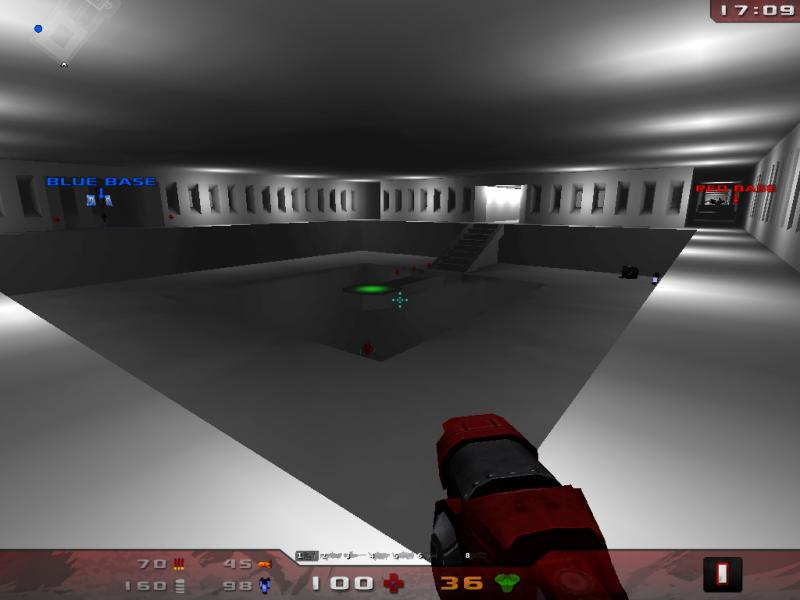
One more new DM map, yay  There is one thing I have to think about sometimes when I see new maps... They are often very bright, there is a lot of white in them :/
It may helps the futuristic look, but I would appreciate it if there would be a bit less of that "bright" 
Why do our new maps use that lot of white/bright colors? In my mind its more difficult to hit the enemy.
|
|
|
Woah thats white. Maybe an idea to dirty the plain white tile textures a little or have some more extreme normal mapping on them. Anything that will add a bit of contrast.
(I just think an arena that is regularly exploded, rail gunned, hit with big fckn' bolts of energy isn't going to be pristine for very long  )
Other than that, looks pretty cool.
Hey, want to learn to map? You might want to start here and here!
|
|
|
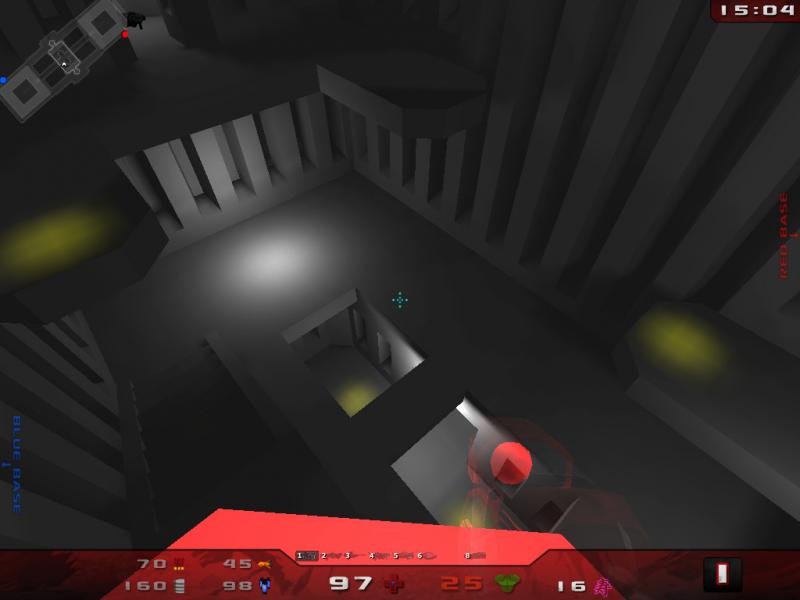
I know it looks very white, but that's only a developer screenshot, light phase is not even compiled.
I aim for something like this:
![[Image: cdj0fquuv3s1gkb9oo3_thumb.jpg]](http://pics.nexuizninjaz.com/images/cdj0fquuv3s1gkb9oo3_thumb.jpg)
This time it's a full compile, and ambient lightning set to 18 (4 is the default).
![[Image: 561.png]](http://stats.xonotic.org/static/badges/archer/561.png)
"One should strive to achieve; not sit in bitter regret."
|
|
|
Looks amazing. Keep up the great work monad.
|
|
|
ECKZBAWKZ HUGE LIST OF ACHIEVEMENTS GOES HERE....
Oh wait.
|
|
|
monad, that looks amazing! 
C.Brutail, the second screeshot looks way better. Its not that bright, nice.
|
|
|
10-18-2010, 12:59 PM
(This post was last modified: 10-18-2010, 12:59 PM by rainerzufalldererste.)
![[Image: viewer.php?file=cdj0fquuv3s1gkb9oo3.jpg]](http://pics.nexuizninjaz.com/viewer.php?file=cdj0fquuv3s1gkb9oo3.jpg)
![[Image: viewer.php?file=8k8u2ch61otdixadn6or.jpg]](http://pics.nexuizninjaz.com/viewer.php?file=8k8u2ch61otdixadn6or.jpg) WHOOOOOOOOOOOOOOO!!!
WHOOOOOOOOOOOOOOO!!!
MY NOOB STATS:
![[Image: 788.png]](http://stats.xonotic.org/static/badges/minimal/788.png)
|
|
|
10-19-2010, 04:56 PM
(This post was last modified: 10-21-2010, 12:37 AM by CuBe0wL.)
More sauce:
![[Image: 3r27m5ru9db5fr56nuj_thumb.jpg]](http://pics.nexuizninjaz.com/images/3r27m5ru9db5fr56nuj_thumb.jpg)
Soy sauce that is.
*MOD: Thumbnails...
nomnomnomnonmonm:
"the best trolls are indistinguishable from idiots"
|
|
|
:O
nice...! Soylent? (soy sauce  )
Very nice!
|
|
|
mmmmh ramp jumps ftw! Plus, it looks amazing!
|
|
|
@Rad Ished: yeah, looks perfect.
Do you plan to keep the exact same structure as soylent map or do you allow you some degrees of freedom?
Fat.bot.Slim
|
|
|
10-22-2010, 05:47 AM
(This post was last modified: 10-22-2010, 05:58 AM by Strahlemann.)
@Rad Ished: I love the architecture!
Some ideas and feedback: I really hate the texture on the ceiling and on the pillars on the right side. The little squares don't fit at all imo. The lighting is good, but it lacks a bit of constrast. Your color-scheme is a bit too monotone atm. Introduce some highlights by using some more saturated blueish or greenish lighting as contrast to the yellow-brownish overall tone. I've made some suggestions in the picture below. Otherwise: I'm in a state of pleasant anticipation for the things to come! neat 
![[Image: radishedsoylentsuggesti.th.jpg]](http://img52.imageshack.us/img52/4795/radishedsoylentsuggesti.th.jpg)
edit: i really wonder how it would look if you try to go for some green lighting on the right part.
Ah and some general tips that i used often: Trying another skybox is also always a good thing to do while in alpha-development. And iirc there was this great feature, at least in Nexuiz, to mirror the picture. lefty-mode or something like that. It's always surprising to use it. It gives another view on the architecture and design that a mapper has just seen for so long from the same angles. It's refreshing, especially when working on a map for a long time, and sometimes reveals spots that could need some more attention that have been overseen before.
|
|
|
@Rad Ished, my futur sweet home looks good. Keep it up.
(10-20-2010, 04:50 AM)Rage_ATWM Wrote: @Rad Ished: yeah, looks perfect.
Do you plan to keep the exact same structure as soylent map or do you allow you some degrees of freedom?
Yeah, I want to know too. Personaly I'd like this xono Soylent keep all the tricks of the first one.
Good work.
Awesome, did Qz show you that ?
Nexuiz : I Reach the top5 of the ladder (even top3 I guess). Top1 French for quite some time (when active) of ladder. Top5 of some tournaments (if I remember well)
|
|


![[Image: dm-212871740914.png]](http://img.xonotic.org/dm-212871740914.png)

![[Image: 542.png]](http://stats.xonotic.org/static/badges/542.png)
![[Image: dm-1312872606293.png]](http://img.xonotic.org/dm-1312872606293.png)
![[Image: dm-1112872606568.png]](http://img.xonotic.org/dm-1112872606568.png)
![[Image: 97qgoeugtiu9cvnneop0_thumb.jpg]](http://pics.nexuizninjaz.com/images/97qgoeugtiu9cvnneop0_thumb.jpg)
![[Image: h39bz88g77q3vebk3e_thumb.jpg]](http://pics.nexuizninjaz.com/images/h39bz88g77q3vebk3e_thumb.jpg)
![[Image: 57izertyn6hz15hycc_thumb.jpg]](http://pics.nexuizninjaz.com/images/57izertyn6hz15hycc_thumb.jpg)
![[Image: 60bt3yiej7z9us9npn0m_thumb.jpg]](http://pics.nexuizninjaz.com/images/60bt3yiej7z9us9npn0m_thumb.jpg)
![[Image: x31ox71361xkos37zv8z_thumb.jpg]](http://pics.nexuizninjaz.com/images/x31ox71361xkos37zv8z_thumb.jpg)
![[Image: 561.png]](http://stats.xonotic.org/static/badges/archer/561.png)
 There is one thing I have to think about sometimes when I see new maps... They are often very bright, there is a lot of white in them :/
![[Image: cdj0fquuv3s1gkb9oo3_thumb.jpg]](http://pics.nexuizninjaz.com/images/cdj0fquuv3s1gkb9oo3_thumb.jpg)

![[Image: 8k8u2ch61otdixadn6or_thumb.jpg]](http://pics.nexuizninjaz.com/images/8k8u2ch61otdixadn6or_thumb.jpg)

![[Image: 68.png]](http://stats.xonotic.org/static/badges/minimal/68.png)
![[Image: viewer.php?file=cdj0fquuv3s1gkb9oo3.jpg]](http://pics.nexuizninjaz.com/viewer.php?file=cdj0fquuv3s1gkb9oo3.jpg)
![[Image: viewer.php?file=8k8u2ch61otdixadn6or.jpg]](http://pics.nexuizninjaz.com/viewer.php?file=8k8u2ch61otdixadn6or.jpg)
![[Image: 788.png]](http://stats.xonotic.org/static/badges/minimal/788.png)

![[Image: 3r27m5ru9db5fr56nuj_thumb.jpg]](http://pics.nexuizninjaz.com/images/3r27m5ru9db5fr56nuj_thumb.jpg)
![[Image: radishedsoylentsuggesti.th.jpg]](http://img52.imageshack.us/img52/4795/radishedsoylentsuggesti.th.jpg)