|
|
08-05-2010, 04:27 PM
(This post was last modified: 08-05-2010, 09:05 PM by nowego4.)
Hello,
Edit: Sorry forgot to include this originally: We should change strength to orange and shield to green, I thought this because when red team gets strength / blue team gets shield, both result in a purple--pink color.
Seeing as how the Strength model in nexuiz is the shape of the nexuiz logo, I threw these together in blender:
(left to right: Strength and Shield)
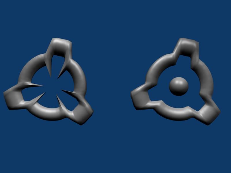
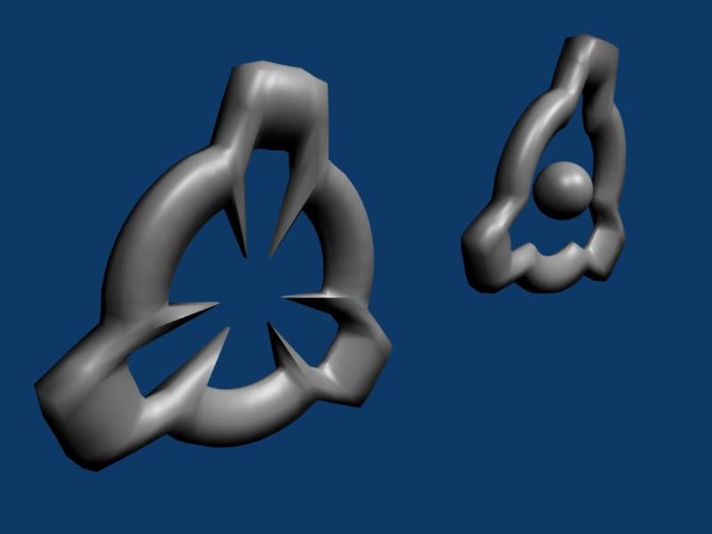
or
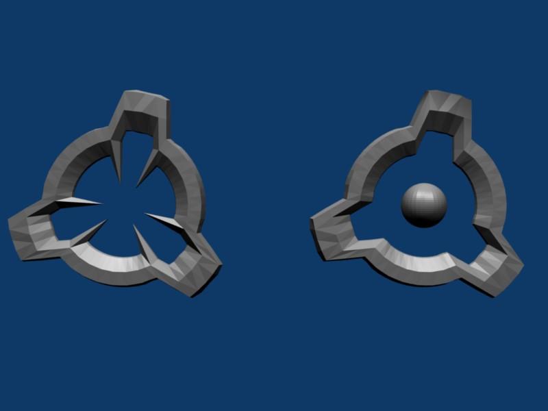
Also the flag model needs to be redone/retextured, because it also has the nexuiz logo on it.
I encourage others to make their own models and post them on this thread.
|
|
|
08-05-2010, 05:52 PM
(This post was last modified: 08-05-2010, 05:55 PM by Roanoke.)
Very good models, I like the faceted and sharp ones more. You should get them textured (that is, transparent and glowing) and get them in a git branch.
As for your idea of changing the colors, I think that a change of glow would be a good idea.
(07-18-2010, 10:59 AM)Flying Steel Wrote: How could anyone with ADHD tell its a high damage weapon if it wasn't a gigantic metal cock fucking the map whenever a player gets within 3 meters of a wall?
![[Image: di-712770583645.png]](http://img.xonotic.org/di-712770583645.png)
|
|
|
Definitely go with the sharper ones. My first thought is that the shape between the two are too similar (even though they have different centers). Perhaps rotate one of them 90 degrees to make the distinction more apparent from afar. Of course, this concern could be mitigated after glow and textures are applied.
asyyy^ | are you releated to chuck norris?
|
|
|
I think they could stay the shapes that they currently are. I really like the look of the smooth ones, but the sharp ones are also really cool. I don't think we want changing colors -- The colors should be the main distinction between these two as they are very much alike.
When you texture them, consider making them opaque as opposed to transparent, because in my honest opinion, the transparent ones look ugly because of overlapping transparency. Or, instead of fully opaque, since these are circular you could go with transparent in the center fading smoothly to opaque on the perimeter. That may look cool.
-- Regards,
Moo
Mapper.
|
|
|
08-05-2010, 09:20 PM
(This post was last modified: 08-05-2010, 09:28 PM by nowego4.)
Ok, I'm no good at texturing, but here it goes...
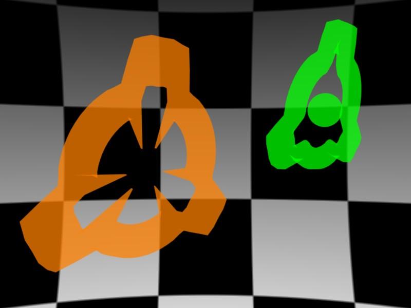
Moo, is this what you meant by overlapping transparency?
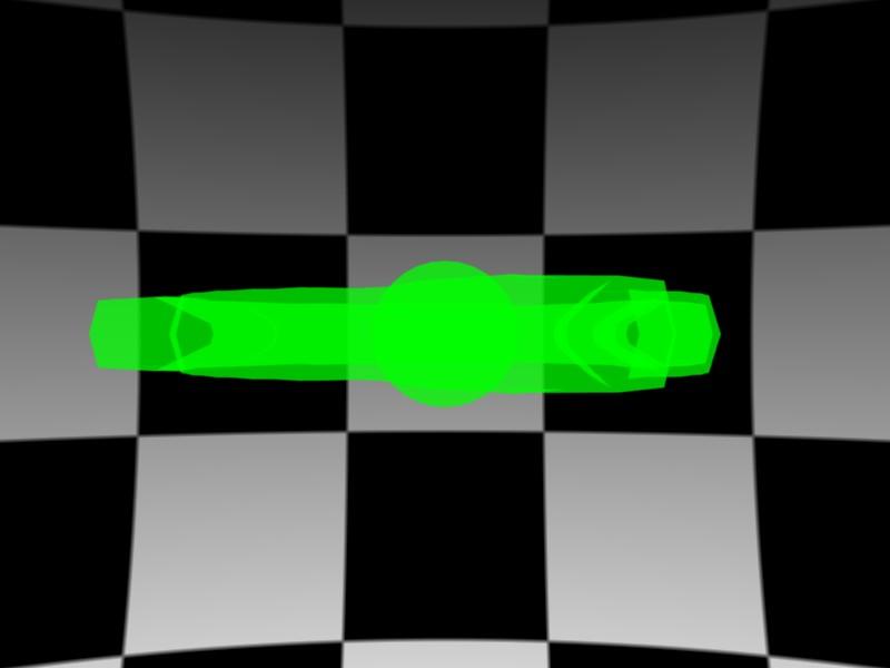
Ok, these are the settings I used in blender:
Strength:
R: 1
G: 0.5
B: 0
Shield:
R: 0
G: 1
B: 0
Both:
Shadeless
Z transparent
Alpha: 0.5
And though they may not look it, these are the sharp ones.
Note: I did not add any "emit" 'cause I thought it was already high enough visibility. Is "emit" the same thing as "glow"? Should I turn off shadeless and activate emit?
Will the materials hold up when moved into netradient (oops I spelled that wrong  ) Also what is the scale difference?
What is "git branch"?
Obviously I'm kinda clueless--when I first heard of nexuiz it was already in 2.5.2 
|
|
|
08-05-2010, 09:39 PM
(This post was last modified: 08-05-2010, 09:40 PM by Roanoke.)
(08-05-2010, 08:34 PM)Moo Wrote: I think they could stay the shapes that they currently are. You mean, nexuiz logo and other Japanese character?
(08-05-2010, 08:34 PM)Moo Wrote: I don't think we want changing colors -- The colors should be the main distinction between these two as they are very much alike. Problem is, the glow that a player with quad/shield gets can create confusion, such as a blue player with red glow.
(08-05-2010, 09:20 PM)nowego4 Wrote: Ok, I'm no good at texturing, but here it goes... Up the opacity a bit, to say .6-.7. Or post a scale from .5 to 1.0 incrementing by .1 
(08-05-2010, 09:20 PM)nowego4 Wrote: Note: I did not add any "emit" 'cause I thought it was already high enough visibility. Is "emit" the same thing as "glow"? Should I turn off shadeless and activate emit? A glow texture for these would be nice, it would help differentiate them from other pickups.
(08-05-2010, 09:20 PM)nowego4 Wrote: What is "git branch"? A git branch is your own version of a git repository (such as the xonotic repo) where you can make changes and later have it merged with the main git branch.
(07-18-2010, 10:59 AM)Flying Steel Wrote: How could anyone with ADHD tell its a high damage weapon if it wasn't a gigantic metal cock fucking the map whenever a player gets within 3 meters of a wall?
![[Image: di-712770583645.png]](http://img.xonotic.org/di-712770583645.png)
|
|
|
Maybe this is better?

Shadeless off
Emit: 0.9
If you don't like the opacity, I can change that again, or just post the blend.
Haha, I don't even have a git version cause I couldn't figure it out 
So you're pretty much speaking greek to me... HELP!
|
|
|
Ah, I like that opacity much better - you can see the features more clearly.
Guide to setting up git: http://dev.xonotic.org/projects/xonotic/...ory_Access
(07-18-2010, 10:59 AM)Flying Steel Wrote: How could anyone with ADHD tell its a high damage weapon if it wasn't a gigantic metal cock fucking the map whenever a player gets within 3 meters of a wall?
![[Image: di-712770583645.png]](http://img.xonotic.org/di-712770583645.png)
|
|
|
(08-05-2010, 09:39 PM)Roanoke Wrote: (08-05-2010, 08:34 PM)Moo Wrote: I think they could stay the shapes that they currently are. You mean, nexuiz logo and other Japanese character?
(08-05-2010, 08:34 PM)Moo Wrote: I don't think we want changing colors -- The colors should be the main distinction between these two as they are very much alike. Problem is, the glow that a player with quad/shield gets can create confusion, such as a blue player with red glow.
(08-05-2010, 09:20 PM)nowego4 Wrote: Ok, I'm no good at texturing, but here it goes... Up the opacity a bit, to say .6-.7. Or post a scale from .5 to 1.0 incrementing by .1 
(08-05-2010, 09:20 PM)nowego4 Wrote: Note: I did not add any "emit" 'cause I thought it was already high enough visibility. Is "emit" the same thing as "glow"? Should I turn off shadeless and activate emit? A glow texture for these would be nice, it would help differentiate them from other pickups.
(08-05-2010, 09:20 PM)nowego4 Wrote: What is "git branch"? A git branch is your own version of a git repository (such as the xonotic repo) where you can make changes and later have it merged with the main git branch.
1) Well, they could but I don't know what I meant. I guess I wasn't thinking when I wrote up that sentence. WARM UP ROUND! XD
2) We don't want changing colors. As you can see from his colored posts, there are plenty other colors aside from red and blue to make these powerups. Also, the glow on players with powerups does get kind of annoying... we could try to lessen the glow on the playermodel so you know which color he/she is.
Mapper.
|
|
|
nowego4 Wrote:both result in a purple--pink color.
ARGH! THAT MAKES ME RAGE SO HARD WHEN I'M ON BLUE AND I TK SOMEONE WITH STRENGTH 
These ones you're working on look very nice. Something I'd really like to see, though, is quad and shield symbols that look like what they are, ie. the quad one might have "STRENGTH" written in the centre. Not essential, but still something I'd like to see 
![[Image: vN3NkMA]](http://ompldr.org/vN3NkMA) (Idea stolen from Mr. Bougo. Hehehehe)
(Idea stolen from Mr. Bougo. Hehehehe)
|
|
|
08-06-2010, 03:28 AM
(This post was last modified: 08-06-2010, 03:29 AM by rainerzufalldererste.)
er... is there something like IOR possible in darkplaces?
you know ... the IOR from blender (tranparency)!
![[Image: glasconice.th.png]](http://img84.imageshack.us/img84/8426/glasconice.th.png)
this image is showing IOR
IOR would look nice for those items!!!
MY NOOB STATS:
![[Image: 788.png]](http://stats.xonotic.org/static/badges/minimal/788.png)
|
|
|
08-06-2010, 10:57 AM
(This post was last modified: 08-06-2010, 10:59 AM by Dokujisan.)
Just for reference, here are the current shield and strength powerups
![[Image: invulnerability.jpg]](http://www.nexuizninjaz.com/pics/invulnerability.jpg)
![[Image: strength.jpg]](http://www.nexuizninjaz.com/pics/strength.jpg)
On a side note, I personally would like to see "strength" called something else. It sounds dumb saying that, so I always call it "quad" from quake.
I like your shapes for these powerups. Even without color, you can distinguish between them pretty clearly.
The issue about mistaken identity when someone uses a powerup in CTF or TDM is a real issue. I've done it before. 
However, to fix that problem, I don't know if the answer is to avoid using red/blue colors for powerups. We might want to consider a new way to show that someone has a powerup besides simply glowing. That way, we can use more colors for powerups in the future.
EDIT: Shouldn't the title of this thread be shield and strength models?
|
|
|
The strengthed/shielded players don't just glow, they are also slightly transparent.
Writing the names of the powerups in the powerups themselves is not a good idea, otherwise we might as well replace all icons and stuff with their meaning in English (and alienate international communities).
(07-18-2010, 10:59 AM)Flying Steel Wrote: How could anyone with ADHD tell its a high damage weapon if it wasn't a gigantic metal cock fucking the map whenever a player gets within 3 meters of a wall?
![[Image: di-712770583645.png]](http://img.xonotic.org/di-712770583645.png)
|
|
|
What's with jetpack and invisible?
When it is possible to have IOR in darkplaces, it would be great to have invisible players with IOR and nearly transparent 
but back to topic: we need models for jetpack and invisible, too!
MY NOOB STATS:
![[Image: 788.png]](http://stats.xonotic.org/static/badges/minimal/788.png)
|
|
|
(08-06-2010, 11:45 AM)rainerzufalldererste Wrote: What's with jetpack and invisible?
When it is possible to have IOR in darkplaces, it would be great to have invisible players with IOR and nearly transparent 
but back to topic: we need models for jetpack and invisible, too! Invisible is shield in minstagib.
Jetpack is fine as is, I think.
(07-18-2010, 10:59 AM)Flying Steel Wrote: How could anyone with ADHD tell its a high damage weapon if it wasn't a gigantic metal cock fucking the map whenever a player gets within 3 meters of a wall?
![[Image: di-712770583645.png]](http://img.xonotic.org/di-712770583645.png)
|
|
|
heyy nowego4!
most file formats aren't allowed...(i had problems with that several times)
pack it into a zip and it works 
I'm away for a week now but I'll take care of them when I come back 
MY NOOB STATS:
![[Image: 788.png]](http://stats.xonotic.org/static/badges/minimal/788.png)
|
|
|
(08-05-2010, 09:48 PM)nowego4 Wrote: Maybe this is better?
Shadeless off
Emit: 0.9
If you don't like the opacity, I can change that again, or just post the blend.
Haha, I don't even have a git version cause I couldn't figure it out 
So you're pretty much speaking greek to me... HELP!
Now that is cool.
ECKZBAWKZ HUGE LIST OF ACHIEVEMENTS GOES HERE....
Oh wait.
|
|
|
08-07-2010, 02:38 PM
(This post was last modified: 08-07-2010, 02:42 PM by nowego4.)
This contains the blend file, obj file, and the screenshots.
I release it under the gpl v2 bla bla bla (I didn't commit it to the repo, do I have to?)
 Strength:Shield.zip
 (Size: 426.08 KB / Downloads: 5)
If you want to give credit, name me as Earthling. 
Oh, and I'll start working on a flag model when I get the time.
|
|
|
Here's the latest:
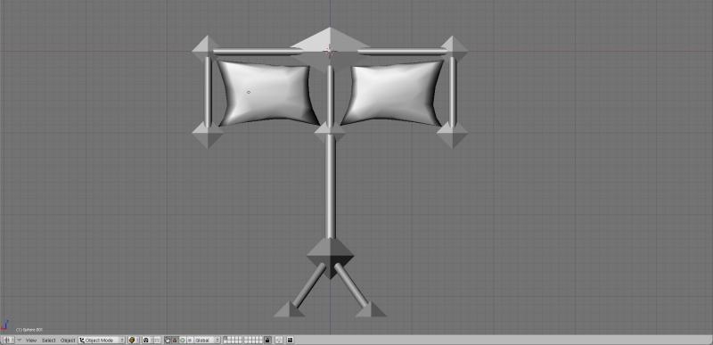
For the texture I was going to put "(color) flag" pasted across the cloth part.
|
|
|
Hm, a bit angular I think.
The cloth also seems odd, looks like pillows. Why not abandon cloth entirely and instead have a "holographic" (partially transparent) display showing the team's color/whatever else.
(07-18-2010, 10:59 AM)Flying Steel Wrote: How could anyone with ADHD tell its a high damage weapon if it wasn't a gigantic metal cock fucking the map whenever a player gets within 3 meters of a wall?
![[Image: di-712770583645.png]](http://img.xonotic.org/di-712770583645.png)
|
|
|
(08-11-2010, 02:32 PM)Roanoke Wrote: Why not abandon cloth entirely and instead have a "holographic" (partially transparent) display showing the team's color/whatever else.
Holographic... I like it 
I'll try to cut down on the angles a bit.
|
|


![[Image: di-712770583645.png]](http://img.xonotic.org/di-712770583645.png)
 ) Also what is the scale difference?


![[Image: glasconice.th.png]](http://img84.imageshack.us/img84/8426/glasconice.th.png)
![[Image: 788.png]](http://stats.xonotic.org/static/badges/minimal/788.png)
![[Image: invulnerability.jpg]](http://www.nexuizninjaz.com/pics/invulnerability.jpg)
![[Image: strength.jpg]](http://www.nexuizninjaz.com/pics/strength.jpg)


